Reduce horizontal axis labels in a chart

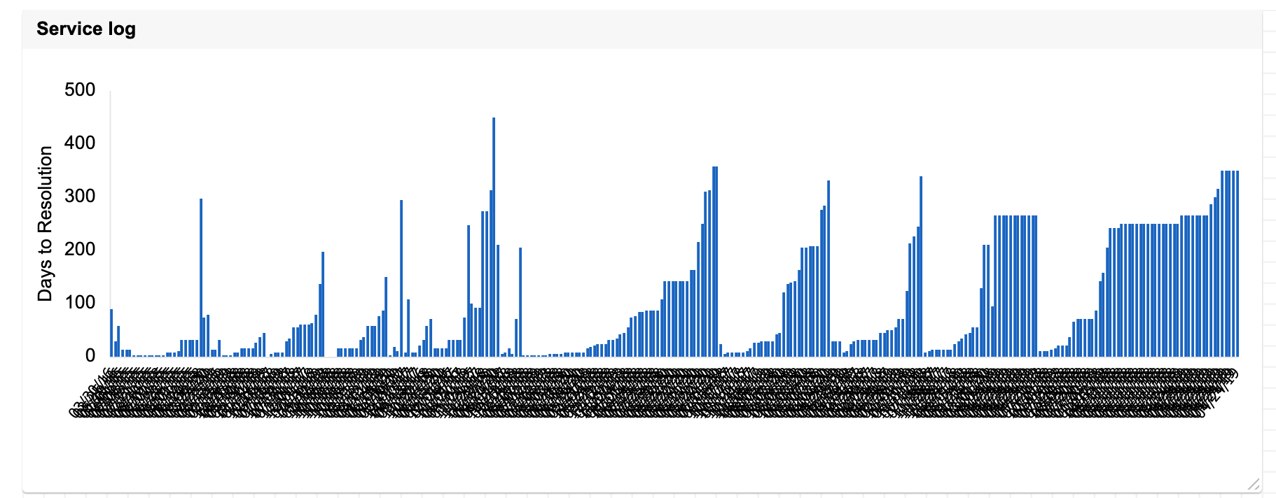
I am trying to chart a lot of data point over multiple years but there are way too many labels on the horizontal axis. Is there a way to reduce the number of labels to allow the chart the be understandable?
Answers
-
Yes. I use a "helper" column for this.
I already have my dates entered into the first column to reference in my metrics formulas. I then add another date type column immediately to the right of the original dates column and label is something along the lines of [Chart Labels]. I then use a formula or even manual entry to only pull certain dates into this new column and the new column is the one I use for the chart labels.
Does all of that make sense? I can find and post a screenshot if you think that would help.
-
That does make sense, but I am getting my data from a report rather than a sheet so I can't add a manual entry column or formula.
-
If you are pulling from a report then unfortunately there is no way to adjust them. Feel free to Submit a Product Enhancement Request when you are able.

Categories
- All Categories
- 14 Welcome to the Community
- 10.7K Get Help
- 63 Global Discussions
- 69 Industry Talk
- 385 Announcements
- 3.5K Ideas & Feature Requests
- 55 Brandfolder
- 125 Just for fun
- 50 Community Job Board
- 464 Show & Tell
- 40 Member Spotlight
- 44 Power Your Process
- 28 Sponsor X
- 234 Events
- 7.3K Forum Archives
