Correcting chart spacing

I am creating a chart on a dash board using a sheet summary report pulling data from 2 sheets.
I am having difficulty arranging the columns as desired no matter how I adjust the widget tools or the columns in the report
Specifically,
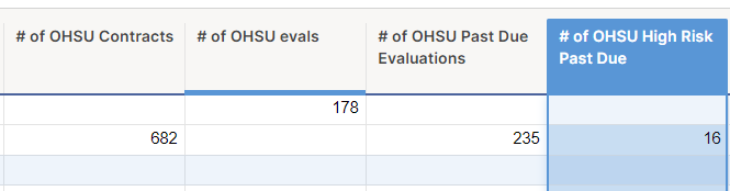
- One column that is pulling data from sheet "A" is on the left and the other 3 columns pulling from sheet "B" are on the right. I would very much like them to be in different order but cannot seem to move them.
- The one column from sheet "A" is separated from the others by a space many times that of the spacing between the other 3. I see no way in the tool to correct this.
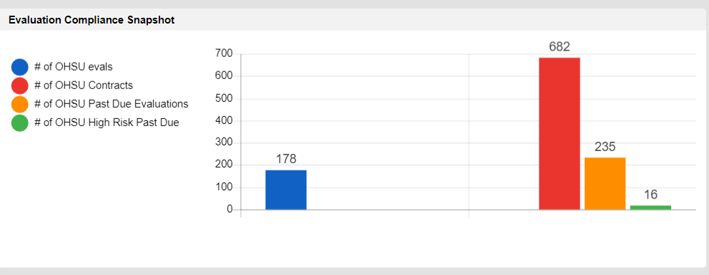
This is the spacing that I cannot change
This is the order I want the columns to be in. The different rows are the different sheets.
Any suggestions would be appreciated!
Answers
-
@Carroll Wall To change the order of the columns, I think you need to reorder the summary fields in the source sheets. But they are on your widget in the order you wanted, just that there are several values that equal zero and this look like gaps.
The gaps are the tool performing as designed: it has left room for the other values, which appear to be zero for the first sheet.
dm
-
Thank you for replying.
If I understand what you are suggesting, the reason that the value for "# of OHSU evals" is on the left is that it is the first value of the top row of the report. And then the tool "reads" the rest of the values across then down to the next row and across. Therefore the large gap between the first and 2nd columns on the chart is due to the lack of data in the the last 2 top row cells. However if that was the case, why is there not also a gap between the 2nd and 3rd column due to the empty cell between them?
Or perhaps I am misunderstanding your meaning?
-
@Carroll Wall It is tricky to be definitive without more data, but I believe each row is a new block of four data elements. So the left side should have blue/red/orange/green and the right side should have the same. The order is shown in the legend (I can't say for sure how that order was derived).
Missing (really, just equal to zero) are red/orange/green on the left (first row), blue on the right (second row). Hence the apparent gaps. I would add more data to clarify the pattern.
dm

Categories
- All Categories
- 14 Welcome to the Community
- 10.7K Get Help
- 63 Global Discussions
- 69 Industry Talk
- 385 Announcements
- 3.5K Ideas & Feature Requests
- 55 Brandfolder
- 125 Just for fun
- 50 Community Job Board
- 464 Show & Tell
- 40 Member Spotlight
- 44 Power Your Process
- 28 Sponsor X
- 234 Events
- 7.3K Forum Archives
