Chart Axis Customization
Answers
-
Having the ability to scale a chart so that like data is on an equal scale is critical. My executives have stopped using our dashboards because the data being conveyed is misleading unless someone is really paying attention to the scale at the bottom.

-
I think this needs to be prioritised in the next updates released because there appears to be a number of people along with myself who are now finding the charts in Dashboards just do not portray the correct story for the data because of the auto scaling.
-
Agree with all... a simple 0% - 100% bar chart is a much needed feature.
-
Adding on to all of these, my organization would also very much like to see this flexibility change happen.
-
Will this option to change our Axis scale be updated in the next version? If not, I'm back to using Excel because Smartsheet just can't give me what I need to clearly paint an accurate picture of reporting.
-
So do we have a fix date here? I have an 95% completion on a new build but my graph scale goes to 120% for some reason. So instead of 5% to go it looks like 25%.
-
To add, how does it calculate the scale? Maybe our answer lies there.
-
First glance it looks like the scale has to do with resizing the window on the page. Hmm.
-
Sasan - It's been a few years with no update. I echo the request of all the previous users. These graphs don't do their basic job of showing data and telling the story visually.
-
I also have a need for this capability, it would seem there is a significant number of users for which this is a critical capability. Is it on the roadmap?
Being able to ensure the visual representation of the information is interpreted properly is a critical need for dashboarding. Adding these types of controls could result in a significant uptake of dashboard usage for Smartsheet. I'm really not a fan of having to revert back to excel for dashboarding, accurate interpretation of visual data is critical to the success of dashboarding.
Please consider adding this capability and other axis related customizations.
-

So much wasted space on dashboards caused by this. I feel a "Highest Value is Top of Graph" button at the very least would not be hard to implement. I've had requests to make the stacked graphs taller, to make up for the lost inches, but that just results in proportionally more wasted space. Come on Smartsheets, this thread started 3 years ago and it's still not fixed.
-


Disclosure: I am a Smartsheet Support Rep
I may have found a possible workaround for this issue, but you may need to fine tune or tweak the solution based on your specific needs.
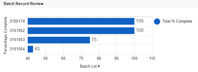
Using test data, I was able to create two columns. I put values in each one fairly close to the previous entry to ensure that the graph wasn't too wide for the scope.
I sorted the data ascending for both of the columns as pictured in the screenshots attached. From there, I was able to go into the dashboard and see that the data was sorted exactly how I had it sorted in the sheet.
Now, since there are two sets of data being sorted this is why it is separated out. BUT, this also means that the graph itself is sorting the data in ascending order.
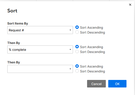
The second screenshot with the options selected is from a report. This will also work with a report, so you can fine tune around some of the values, but it does look like we can get a sort option somewhat close to perfect at least in the realm of setting the values to be sorted by the primary column needed first, and then additional columns after.
I do recommend using a report with the chart widget as this will allow you to use multiple sheets in one location and create your sorting rule from there. It may take some trial and error, but this is as close as I can find without having an actual option to sort.
"Insanity is doing the same thing over and over again, and expecting a different result" - Albert Einstein
“A wise man can learn more from a foolish question than a fool can learn from a wise answer.” - Bruce Lee
-
Just adding another comment in hopes of an improvement being made. The inability to customize the max and min of the axis is really frustrating and gives more energy to the "Excel is better than Smartsheet" haters.
-
Like others, I am adding another comment to this thread to bump this product gap to the top.
100% stacked bar and column charts are extremely common, and any basic software should offer this capability.
When the chart's scale continues to 120%, the reader has to pause to digest the data. This is causing problems for our users, and as @Matt Siglinger rightfully points out - gives oxygen to the SmartSheet detractors.
-
I am commenting as I also would like this feature. We have a stacked bar graph with multiple figures for average number of days. As it is early in the quarter, one site shows a .05 for number of days. Because of this one number, the vertical axis shows -10.


Categories
- All Categories
- 14 Welcome to the Community
- 10.6K Get Help
- 63 Global Discussions
- 46 Industry Talk
- 387 Announcements
- 3.5K Ideas & Feature Requests
- 55 Brandfolder
- 125 Just for fun
- 50 Community Job Board
- 466 Show & Tell
- 40 Member Spotlight
- 44 Power Your Process
- 28 Sponsor X
- 234 Events
- 7.3K Forum Archives
