Moving value labels on stacked graph

RoseMiller
✭✭
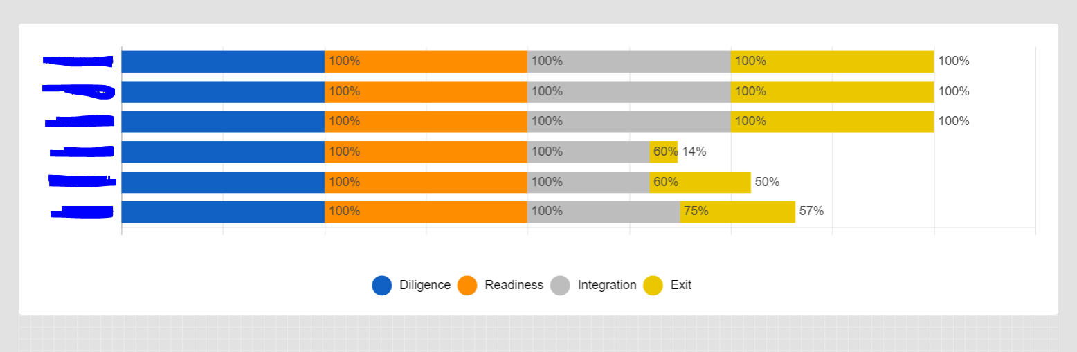
Is there any way to change the location of the labels on a stacked graph? They appear to the right of the bar and with multiple items in the stack, it is misleading as to what the label represents.
See below - the 4th item down in grey represents 60% but the 60% label is on the yellow bar.
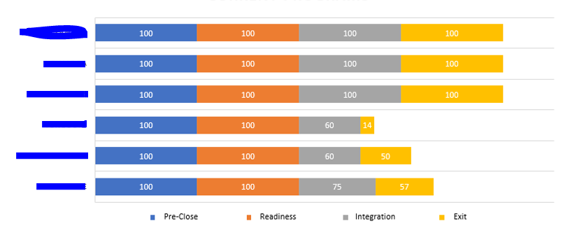
We want the graph to look like this:
I stretched out the graph per the below convo, it helped a little, but I still feel like the value is confusing as displayed to the right.
Any other way to display the values over the actual bar they represent?
Tags:
Answers
-
Hi @RoseMiller
There currently isn't a way to customize the format of where the values appear in in a stacked chart; please provide your feedback to the Product team through this form, here!
Thanks,
Genevieve

Categories
- All Categories
- 14 Welcome to the Community
- 10.7K Get Help
- 63 Global Discussions
- 68 Industry Talk
- 385 Announcements
- 3.5K Ideas & Feature Requests
- 55 Brandfolder
- 125 Just for fun
- 50 Community Job Board
- 464 Show & Tell
- 40 Member Spotlight
- 44 Power Your Process
- 28 Sponsor X
- 234 Events
- 7.3K Forum Archives
