Stuck! Creating a Dashboard from a Sheet from a Report from Sheets. :/

Maybe I'm making this harder than it is but I can't figure out a way. I'm working towards ultimately building a Dashboard Chart (Pie Chart) based on Summary data from around 54 project schedules. I've created a Report that contains the information I need from the Summary information from each schedule (54 lines of summary information). I then want to create a table based on that data so that I can use it in a Chart in a Dashboard. However, I can't seem to get the Report to group the same way I can do in a Sheet. I can do it when I use a Sheet that uses COUNTIFS to another sheet but I can't do that as a Report to another Report.
Basically, I need a table from my Summary Report that ultimately looks like the attached or some other suggestion that gets me to that same end.
Best Answers
-
Ah! Thank you for clarifying, this screen capture helps a lot - from the original description I assumed the area that had Red/Yellow/Green was a Status column in the grid of the sheet, and that the Summary fields were being used to create metrics.
With your current set-up, the Summary you could get from this Report would be a total number of Red or Yellow or Green status balls in your Overall column across all projects, like this:

There wouldn't be a way to break out each colour as its own column - instead it would be a Grouping within the Report. The Report can then show what colour is associated with each Department, but the Chart would display the totals in each category.
Would that work for you?
Cheers,
Genevieve
-
I think this will get me a lot closer to where I need to be. Thank you! :)

Answers
-
Is their a reason you have to use a report and not use the sheet to create the dashboard?
-
Yes, a Sheet won't allow me to get the data I need from a Report. A Sheet will only allow you to link to another Sheet (unless I'm missing something).
What I want...
Sheet -> Report -> Sheet -> Dashboard
I need a Report in there to summarize the data from all those project schedules.
Hope that makes sense.
-
The report pulls data and groups directly from your original sheet. You should be able to reference your original sheet(s) instead of the report in your sheet that goes to the dashboard to pull in the data that is going to the report.
I rarely use reports as their functionality is much more limited than creating a sheet to report my data. It takes a bit longer and more work to put in the formulas needed for a report but once it is built most of mine automatically update with future data and with the reports filters I have to consistently update filters for the timeframes I need.
-
Well, that would be using a COUNTIFS against 54 sheets so not really manageable. Not to mention that sheets would drop and add every few weeks. If this were only a few sheets, I'd totally agree.
-
Can you post a screen capture of an example Sheet Summary you have set up in your sheet along with the formulas you're using?

I presume you have 3 fields, "Red", "Yellow", and "Green", each with their own calculation, like this:

Then in your Summary Report you should have a table that looks almost identical to what you have screen captured above.
However it sounds like you're trying to get a TOTAL from all of these sheets, is that correct? A chart can only look at a Report either as a line-by-line data sheet or as a Grouped & Summarized Report (with one level of both Grouping and Summary).
In the table above, there's nothing we can group by, since they're all unique fields with unique values. You would need to have some sort of common field among all of your sheets, perhaps "Chart Data" with the value of "Summary", like so:

Then because that exact same field exists across all your sheets, you can Group by this and it will group the entire Report. Now you can add your Summaries and it will roll up into a Header that a Chart can use:

Note that you can remove the "Chart Data" column in the Report, it doesn't have to be visible for you to Group by it. Let me know if that makes sense and works for you!
Cheers,
Genevieve
-
So looking at the screenshots, I believe your first screenshot is a Sheet with a Summary of each Schedule (Sheet) by line. That's the crux of what I'm trying to avoid as a Report can summarize all the other 54 sheets in a workspace, making it a lot easier than manually adding and managing each sheet. I mean, your solution is a little easier and might help a bit from where I am today but still doesn't get me to where I really want to be in order to minimize the manual stuff.
I think this is what you're proposing.
Sheet (54 Schedules) -> Sheet (line by line Schedules with Sheet Summary) -> Report -> Dashboard
I think this will work but I was trying to cut this down a bit more from managing the work related to the second sheet in the steps but let me run with this and see if it's not too much to manage.
-
It sounds like I've misunderstood your set-up. Do you not have any Summary Field data at the moment?
If so, are you using a Row Report to gather all 54 schedules into one Report, then Grouping by the Sheet Name, with a secondary grouping by the Status column? (Screen captures would help here, but please block out sensitive data).
If you're using the second scenario, you're correct. There isn't a way to then chart immediately off the Report since Charts will only take the first summary (e.g. the number of rows per sheet) versus what sounds like your second Grouping, which would be by Red/Yellow/Green under each of these sheet names.
You could collapse this Report then include it in your Dashboard as a Report Widget to display the numbers per-department that way, but it wouldn't be in a chart.
-
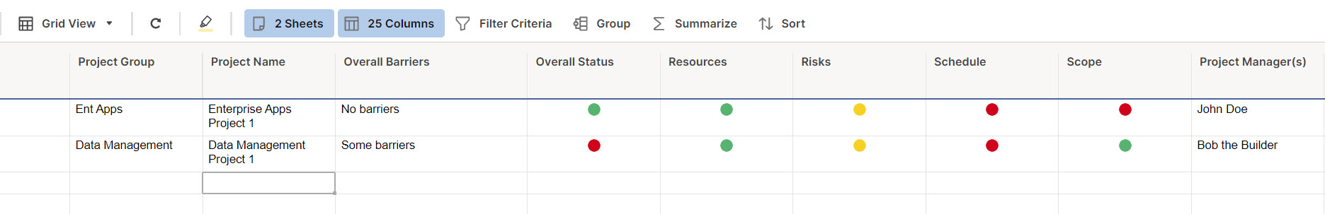
Each of the Schedules (Sheets) does have Summary Fields and I have a Red/Yellow/Green option for things like Overall, Scope, Resources, Schedule and Budget (only need Overall for what I'm trying to do though) that a PM working the schedule can select.
Attached is the screenshot (mock data) of the Report that looks at the Schedule sheets and pulls the Summary data from each. This nice thing about this is that every time a schedule is dropped in that workspace, it's automatically added. So my desire would be to create a table that looks at this Report to Summarize the Overall to something like I have in the Mock Data screenshot in the original post.
Hope this helps.
-
Ah! Thank you for clarifying, this screen capture helps a lot - from the original description I assumed the area that had Red/Yellow/Green was a Status column in the grid of the sheet, and that the Summary fields were being used to create metrics.
With your current set-up, the Summary you could get from this Report would be a total number of Red or Yellow or Green status balls in your Overall column across all projects, like this:
There wouldn't be a way to break out each colour as its own column - instead it would be a Grouping within the Report. The Report can then show what colour is associated with each Department, but the Chart would display the totals in each category.
Would that work for you?
Cheers,
Genevieve
-
I think this will get me a lot closer to where I need to be. Thank you! :)
-
@Genevieve P. - Now that I've stepped through and created all the above, this got me EXACTLY what I was trying to do. Thanks! 😁
-
Oh awesome! I'm so glad to hear it 🙂

Help Article Resources
Categories
- All Categories
- 14 Welcome to the Community
- 10.7K Get Help
- 63 Global Discussions
- 68 Industry Talk
- 385 Announcements
- 3.5K Ideas & Feature Requests
- 55 Brandfolder
- 125 Just for fun
- 50 Community Job Board
- 464 Show & Tell
- 40 Member Spotlight
- 44 Power Your Process
- 28 Sponsor X
- 234 Events
- 7.3K Forum Archives
Check out the Formula Handbook template!