Best Of
Table View - sheet filters need to use common UI conventions
Table View sheet filters do not support:
- Ability to tab. Example: click three dots on a date column, select filter, select "between", enter start date, tab to finish date, but tabbing causes the window to close instead of move the cursor to the next date field.
- Search function filtering is not intuitive. Select a column, enter a keyword, results show (20 for example), click "select all" and it selects all rows in sheet not just the 20 from the search results.
 Paul Tibbits
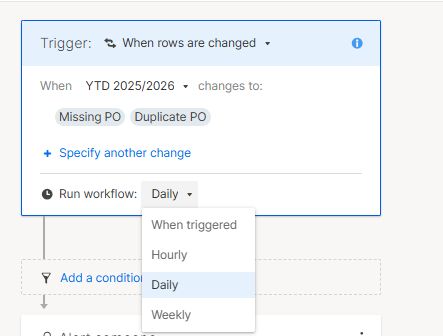
Automation Run Options - Add Workday and monthly as an option
Problem Statement
Current automation workflows run based on calendar frequency only, without considering working days.
For reminder-based workflows, this creates unnecessary noise. When notifications run over weekends, users return on Monday having received multiple duplicate reminders, which leads to:
- Perceived spam and reduced engagement
- Increased user complaints
- Decreased effectiveness of reminder workflows
Use Case
Reminder workflows for forecast updates require human action. These updates can only realistically occur during working days. Running notifications outside this window provides no value and creates friction.
Proposed Enhancement
Introduce an option within Automation Workflow settings:
“Run on workdays only” (optional configurable working days, for example Monday to Friday)
Bonus: Run monthly (for other use cases)
 Amy Munro
Re: Spam from public form
Appreciate the discussion happening here, and I am going to try the restrict speak to fill option, though as @ChristinaP mentioned, our Spam contains emojis and some wild punctuation not really in line with what you'd see on Speak to Fill.
We have seen a HUGE increase in spam over the last month via one of our public facing intake forms. Prior to last month, we had never seen even one spam submission, but over the last month it has been 10+. We also have CAPTCHA enabled, though it seems to not be stopping the influx. The idea of changing the URL would definitely fix the problem, but again as @ChristinaP mentioned in her use case, this URL is on a public facing site, on QR codes, table banners, etc. etc. Basically changing the URL would create a financial impact to get it changed.
Have we seen anything officially from Smartsheet about the issue? Again, thanks to everyone for the input!
 Ryan.Ray
Remove Fields marked with an asterisk (*) are required.
The "Fields marked with an asterisk (*) are required." is redundant when the form stops folks anyway. Can we toggle this off?
 Daniel Goodman
Re: Deactivate form after set # of entries/submissions OR by date
It would be great if there was an option to have an end date for a form submission so that you do not need to go in manually and make it inactive.
Jessicahaupt
Re: Deactivate form after set # of entries/submissions OR by date
We have medical classes with a limited number of spots on a weekly basis. Right now we have to do separate sheets for each class, which is very tedious and overkill, we have to try and catch the sheet and form with alerts, in order to deactivate the form so we don't go over our state mandated ratio limit.
Limiting the amount of rows you want a sheet to have or the number of form entries would be amazing for the medical field in soooooo many ways!!!
 Kari G
Timeline & Portfolio Visibility for Multi-Project Reporting
Hi Everyone,
I’m exploring whether Smartsheet can support a portfolio-level timeline view for our leadership team. I’m aware of the Timeline feature, but I’m looking for something more flexible and consolidated.
Ideally, project managers would be able to select specific milestones or key tasks to surface on a shared timeline. A key requirement is that these milestones/tasks appear within the same timeline bar as the project itself—not as separate rows above or below—so the view remains compact and easy to scan across 50+ projects.
We’re aiming for a printable view that shows projects grouped by business unit, team, and project, with a rolling 90-day window.
The goal is to help leadership quickly identify:
- Potential conflicts (e.g., overlapping deployments or major events)
- Opportunities to adjust schedules
It would also be helpful to include:
- A clear, at-a-glance visual project health indicator (e.g., green check, yellow warning, red x issue, blue ice for on hold)
- A visual % complete indicator (such as a Harvey ball)
Has anyone implemented something similar, or found an effective workaround? I’d especially appreciate guidance on keeping key milestones embedded within the same timeline bar rather than expanding the view with additional rows.
Thanks in advance!
 naguirre1224
Rotate View for Attachments
Please create a way to rotate the view for attachments in Smartsheets. Right now you have to download the attachment to change the rotation.
David.Nethery
When updating any setting for recurring email or update requests prevent "This date and time must be in the future error" for start date
It would be nice to not have Smartsheet do a full validation check on all fields for existing scheduled recurring emails or update requests. It is nice to have the historical value of the original start date for the recurring task, and an annoyance to have to change the start date to next day when just updating the end date or recurring cadence (day, frequency, or time).
Miami_Fins
Duplicate Auto-Number IDs Appearing in Our Sheet — Multiple Consecutive Duplicates
Hi all,
We're facing a strange issue in our Smartsheet where the Auto-Number column (used for Purchase Offer IDs) has started generating duplicate values — not just once, but in a consecutive block.
Here’s a screenshot of what’s happening:
We’re using Smartsheet connected to a front end via Vue. The Auto-Number column:
- Is not editable
- Is not imported from other sheets
- Is not manually copied or filled
- Generates a new value when a new row is created
But somehow we now have duplicate IDs like:
#750#751...#761#751#752...#761
Has anyone seen this before? Could this be caused by:
- Automation duplicating rows in parallel?
- Sheet copy/import/reset?
- An API integration not triggering the Auto-Number logic?
We’re only seeing this issue recently and not across all new rows — just a subset. Any insights, debugging tips, or official clarification would be incredibly helpful!
Thanks in advance!
Maria Dumitrica