Hi everyone,
So, I am trying to chart some data on a double line graph, but I can't seem to figure out how I should go about doing it. I am familiar with how to make graphs on the dashboard from a report, but I only know how to make a single line graph. Here's what I'm trying to achieve:
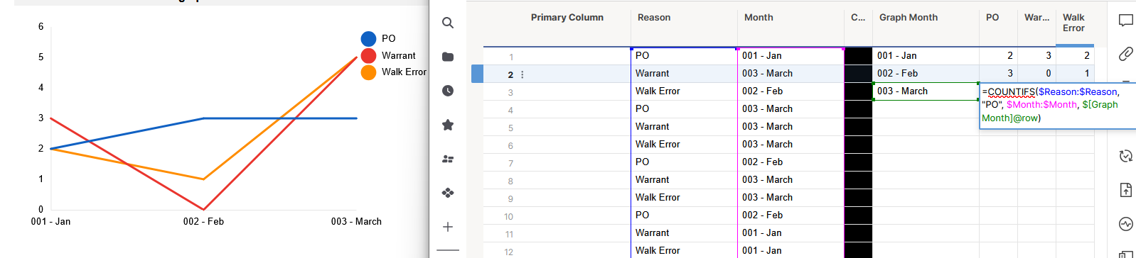
I want to chart specific "reasons" over each month and have each line be a different "reason" to show the values over the year. Here is a screenshot of the main sheet where I am pulling data from:

You can see on the right I have that "reasons" column. That is what I am trying to chart but only a couple of them. I tried creating a new sheet to reference this one, but I can't figure out the best way to lay out the data and what formulas to use to pull the specific reasons and their quantities over each month. Or how to make it so the correct data shows on the x and y axis. What would be the best way to go about this? If you have any questions or need me to clarify, please let me know. Any help is much appreciated.
Thank you in advance!