Dear Community,
I'm trying to create a bar chart to show when a team is planned to perform depending on the week of the year, in a time frame of 12-weeks. The week's time frame is dynamic, and is updated by formulas depending on the current week's value.
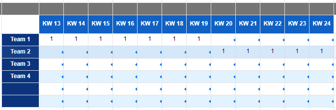
My data is set up as in the next image, where cells having a '1' represent the team is scheduled.
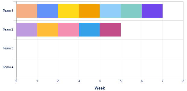
I'm trying to show this in a chart similar to the one below but I am having the following issues:
a) I can't make the FW's to be shown in the horizontal axis
b) I can't make each Team, to have 1 series for all weeks (each week is being considered as 1 individual series)
The image below shows what I achieved by using stacked bar chart, but still is not fully as I need it.
Thanks in advance for your hints and answers.
Juancarlos

