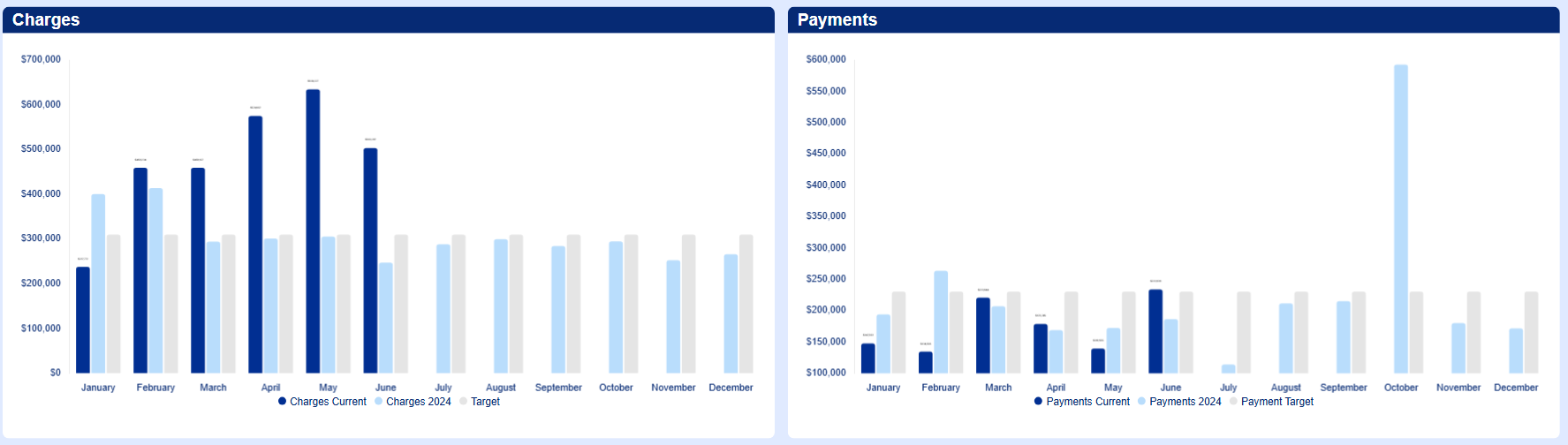
The new update to the Series Font labels to shrink to match the bar size within the Chart Widget has made all of our data labels unreadable. We trend a variety of month over month data for a 12M period across 30+ Dashboards and have always been able to display the Data Labels clearly. Each data label is over 7 figures and scaled appropriately. Now, with this update, the font size is minuscule. I would respectfully request this feature to be turned off or have the ability to be disabled based off of the users preference.