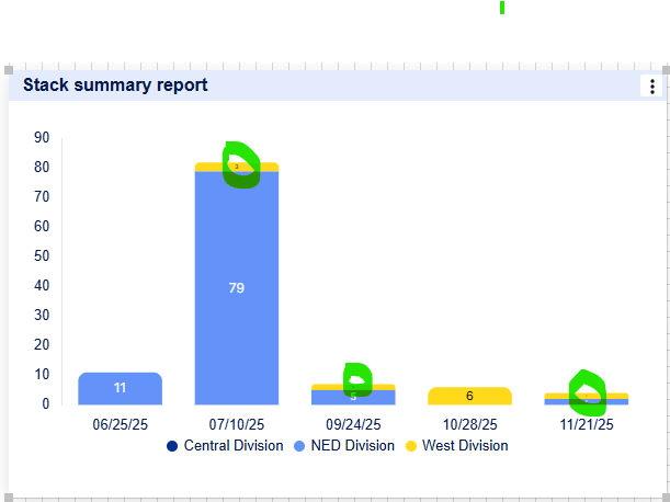
I'm trying to create a graph chart that captures monthly count of records by divisions (Northeast, West and Central) that should be stacked with a legend displaying each by different color like a presented in Excel. When I attempt to duplicate the process in Smartsheet I receive the following results.
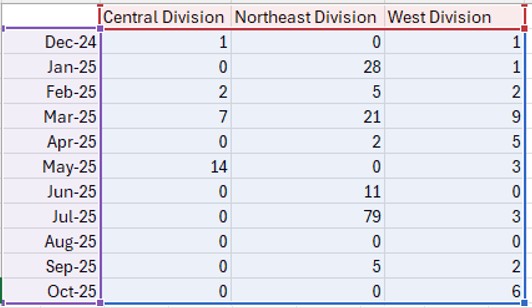
In Excel, I created the following spreadsheet by division:
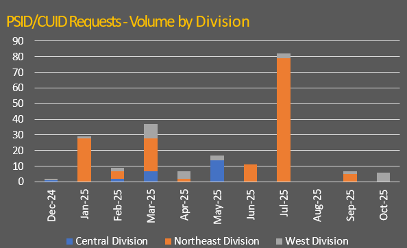
Which designs this stacked graph chart:
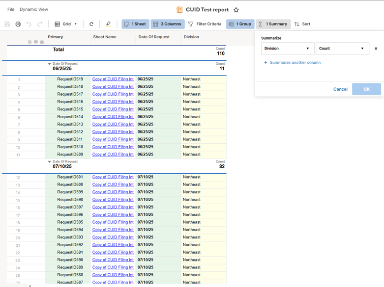
In Smartsheet, I created this report pulled from my data:
I designed the following graph chart which I edited the column name to Stacked Column:

The problem is that I cannot get multiple colors representing the multiple divisions within the column bars and the legend should read, Central, Northeast and West. I'm sure the issue exists in how my report is created but any help would be highly appreciated.