I am creating a productivity tracker for my department of 9 people. Each person has a sheet where on a daily basis we note the amount of time we spend on a task and the department we do the task for (we are in IT so we have 15 departments we can work with). I've created metrics on each sheet for the total number of hours spent working for each dept, the % time and then the time bucketed into 4 major categories. From that sheet, I've created a sheet report for each person that will have both of those criteria (total time and % time) against each department then created an actual report for each of our IT departments. Lastly, I then created a master report that pulls in all of the data from each person so I have one report for the full IT dept.
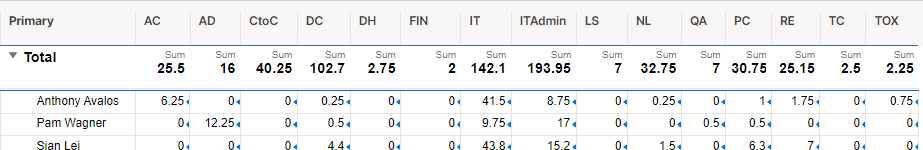
Now I need to graph the total amount of time we spend as an IT department working with each of the departments we support. The first silliness is how do I get my master report to be a sum of all of the data? Right now, I have a row for each of us and columns for each dept:

Of course when I go to my dashboard and try to graph it, it grabs each cell but doesn't sum them. How do I sum the report or how do I create a report that sums each column so I have one total for each department?