Dashboard Chart Widget Axis changes with each refresh

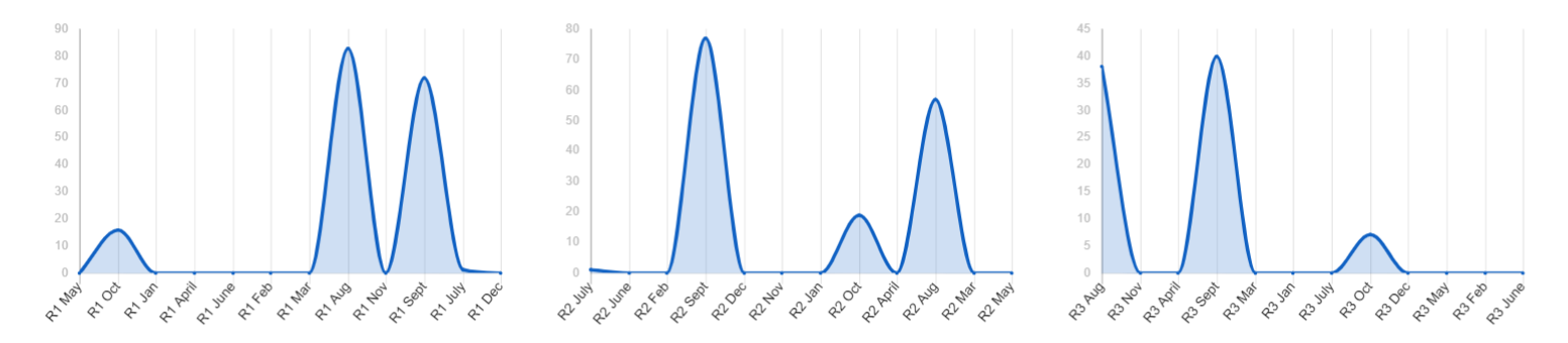
The axis label on the dashboard chart widgets consistently changes with each refresh and will not maintain the order that it is in on the Report.
This is pulling from a summary report.
Occurring on a monthly report widget and quarterly.
I have a Support ticket in, but no good response. This is happening on multiple dashboards with various reports. I have changed the viewer mode, but that is not the answer.
Best Answer
-
Hi @Kayla
Thank you for reporting this unexpected behaviour. I'm able to reproduce this when group and summary are applied to the chart's source report.
I've checked in with our Support team and they confirmed this is a known issue that we're actively working to resolve. I don't have an ETA for when a fix will be applied, but we're working on it!
Cheers,
Genevieve
Need more information? 👀 | Help and Learning Center
こんにちは (Konnichiwa), Hallo, Hola, Bonjour, Olá, Ciao!👋 | Global Discussions
Answers
-
Hi @Kayla
Thank you for reporting this unexpected behaviour. I'm able to reproduce this when group and summary are applied to the chart's source report.
I've checked in with our Support team and they confirmed this is a known issue that we're actively working to resolve. I don't have an ETA for when a fix will be applied, but we're working on it!
Cheers,
Genevieve
Need more information? 👀 | Help and Learning Center
こんにちは (Konnichiwa), Hallo, Hola, Bonjour, Olá, Ciao!👋 | Global Discussions
-
@Genevieve P. - THANK YOU!
-
@Genevieve P. - have you heard any updates on this Support issue?
Help Article Resources
Categories
- All Categories
- 14 Welcome to the Community
- Customer Resources
- 66K Get Help
- 429 Global Discussions
- 149 Industry Talk
- 488 Announcements
- 5.2K Ideas & Feature Requests
- 85 Brandfolder
- 152 Just for fun
- 74 Community Job Board
- 499 Show & Tell
- 33 Member Spotlight
- 2 SmartStories
- 305 Events
- 36 Webinars
- 7.3K Forum Archives
Check out the Formula Handbook template!