Graphing from a grouped report- 'Unnamed series" in legend

Hello,

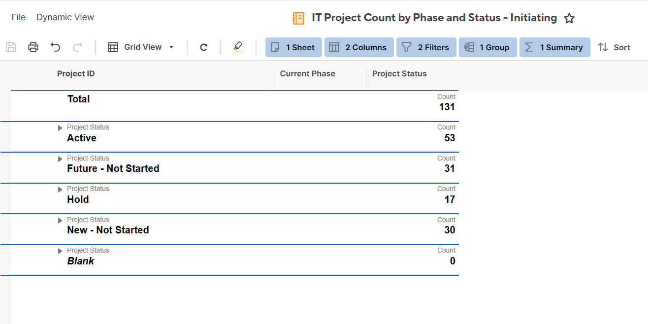
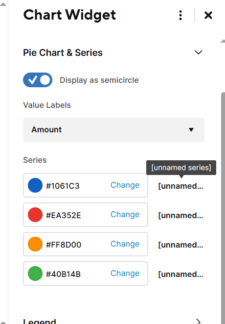
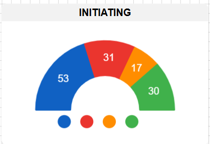
I'm using the new graphing from a grouped report feature which is really cool EXCEPT my legend says "unnamed series" instead of the actual series names.

I have a report where the data is grouped into 5 levels

I want a pie chart for the levels. The data is correct but the legend is blank. I need the legend to display the "Level" from the grouped report that corresponds to it's piece of the pie. Otherwise, the graph is not informative.

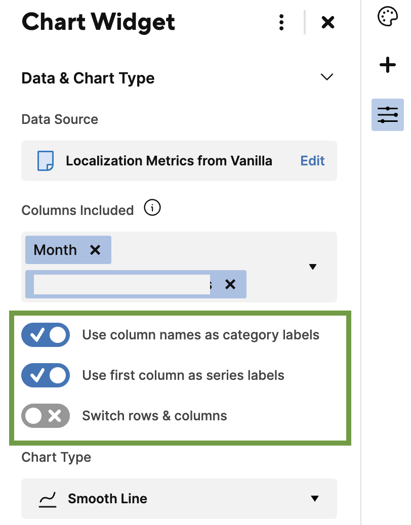
Any suggestions for how to make this feature work well?

Thank you!

Answers

  • Genevieve P.
    Genevieve P. Employee Admin

    Hi @Alison C

    I'm unable to replicate this in my sheet - the legend shows the correct Grouped name.

    I see that you have the Sheet Name column in your Report, is this needed? Try taking out the extra column to see if this helps the Chart widget identify what to use for the legend names.

    If this hasn't helped, can you clarify how the Level values are being populated? Are you using a formula to create "Level 1" etc, or is it a manual entry? What type of column is this? I'll see if I can replicate what you've pictured!

    Cheers,

    Genevieve

  • Hi Genevieve,


    I removed my "sheet name" column and I still get the same result.

    My report is grouped by "level" then there are three columns that are summaries that I would like to graph individually. When I create my widget I pull in in all data from the report then, using the column selector in the widget editor I select just the column that I want to graph as the pie chart. In this case the selected Column is "Level"

    On the main sheet the Level column is populated using a single select drop down.

    Here is a larger view of the collapsed summary report (excluding column headers). In the end I want three different graphs for summary level information, one for each summary column.

    In the end I ended up ditching the idea to graph the grouped report and made my dashboard using Pivot and it worked beautifully. I would still like to figure this out as some members of my group don't have the Pivot to leverage.

  • Genevieve P.
    Genevieve P. Employee Admin

    Hi @Alison C

    Thank you for clarifying! I believe this may be occurring based on how the Grouping works in Reports. When you're using the grid data to create a chart (such as from a Sheet or Report without grouping) then it's easy to exclude or include columns as needed. However for a Grouped and Summarized Report, the Chart is built to look at the entirety of the Report.

    Since you're looking to create three different graphs, I would suggest creating three separate source Reports: one for each graph. In each source Report only have the exact columns you need. This should allow you to have the legend appear with the grouped name!

    I have to admit I'm unclear if this is expected or an issue with the new grouping feature. If you have a moment, please provide your feedback to the Product team, detailing your experience.

    Cheers,

    Genevieve