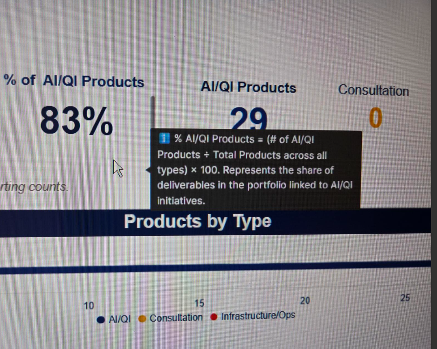
Would be great to have hovering tool tips for widgets in Dashboards. Also on Reports, if the column description could carry forth from the sheet, would be great.
Sign in to see the current vote count, add your own vote, or leave a comment.
I just saw this very interesting post from @vatsal.shah on using conversations on Dashboards.
This got me thinking of other uses that Dashboards generally miss to inform stakeholders. It would be great to be able to add Widget Descriptions for additional context.
As a partner, I get this question a lot, as people want to know how charts are generated, what data entries are used, or where to look for more context on this.
I think having it work similar to column descriptions would be great way to address this.
Seeing the annotation option, I feel it should be possible to add a description option that can be updated much like a title in the Widget Editor?
Love that idea! 😃
Agreed, love this! Today, we use rich text widgets when we need to add descriptions, but this takes up valuable space on the dashboards. Being able to hover over a widget for a description, or have an i icon in the corner to indicate a description, would be AWESOME.
I’ve been raising this request for years. The only workaround I’ve found is using the title of a widget but not actually showing the title. I add a short description as text, set the font and fill to match the widget color so it’s invisible, and then when you hover over the widget and the text appears as if it were a tooltip.
In the Resource Management Plan Settings in Control Center, there is no way to link the Client and Project Code fields even though they are not Custom fields and part of the first 3 fields you enter when creating a new project. I can't select them in the Custom Resource Management Information Fields because they are not…
I’d like to see user analytics for WorkApps. I’ve checked the user report available in the Collaborator Pack, but it only shows how many times someone has clicked into the WorkApp each month. I’d like to know: Which resources (dashboards, sheets, forms, etc.) are getting the most traffic? Where are people spending their…
The 'Sheet' icon appears purple in the left navigation but blue within the sheet, creating inconsistency. Aligning icon colors across the platform would improve clarity and simplify user training. Please standardize the icon color to enhance user experience and reduce confusion during onboarding.