Connect with peers, share your expertise, and inspire what’s next in Smartsheet — from proven practices to practical how-to insights from fellow users and product experts.
Sign in to see the current vote count, add your own vote, or leave a comment.
When I select a bar type, it defaults to a single color. It would be better to allow the user to modify the value to a different color.
In prior versions of Smartsheet, I could customize the individual bar colors in a chart widget for a dashboard. That ability seems to now be gone and all of my charts look the same because they all rely on the color theme. It doesn't make sense for a chart that is displaying how many HIGH, MEDIUM, and LOW requests a team received to be dark blue, light blue and orange. I want them to be red, yellow, and green. Please bring this capability back! We need greater chart flexibility, not less.
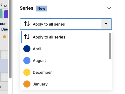
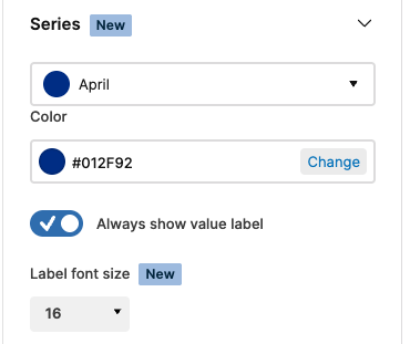
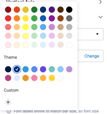
Hi there, please the the steps below in order to change the color of a series value in a bar chart on a dashboard.
Go to edit mode, select the chart and then series, open the series drop-down, select the series you want to modify the color for and then click 'change' to open up the color picker where you can select for a variety of colors or enter a desired hex code (click the + button and enter in the code to add it).
Thanks,
Barak
Sign in to comment or add your vote.