Hi everyone, hoping for a little help here,
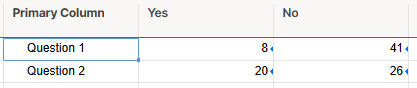
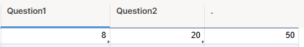
I recently did a survey of 240 employees with 9 yes or no questions. I am hoping to create either a linebar or stacked linebar graph showing the 9 questions in a single chart with the question being on the left axis.
When I try to do a report to create this graph, Im unable to figure out a way to do this with group.
My columns are check boxes but I could change them to "yes" and "no" if that makes any difference.
I feel like this shouldn't be hard at all. Can anyone step by step this for me?
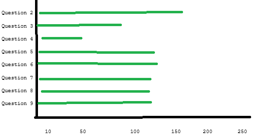
What i'm hoping for, where the green line indicates how many answered yes: