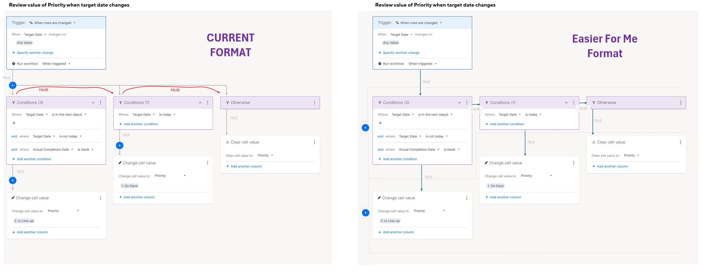
I'm a visual person and I frequently find myself taking pause while trying to add on to automations that have multiple decision points due to the way the builder lays out the decision points. It slows me down and makes me second guess if I have placed the decision point in the correct location. The decision point is actually the box that the user populates, not the blue "+" sign which is not what the path identified by the arrow leads you to believe. It takes me time to visualize that if the answer to the condition is "false", the path you would travel along the arrow is to backtrack up the input arrow to the blue "+" (or junction in the line) and then over to the right to the next box populated by the user. It's a subtle visual change, but one that would simplify and streamline the experience for me. Does anyone else find themselves taking time to rehash this out in your mind when building automations? Attached is an image of how I visually interpret the layout today, and how I think it could be adjusted to improve the condition.