Best Of
Re: May Question of the Month - Join the conversation and receive a badge
I'd say "Mommy fixes things" hahaha
 Cayla Davis
Re: Pull form responses into another sheet & display vertically
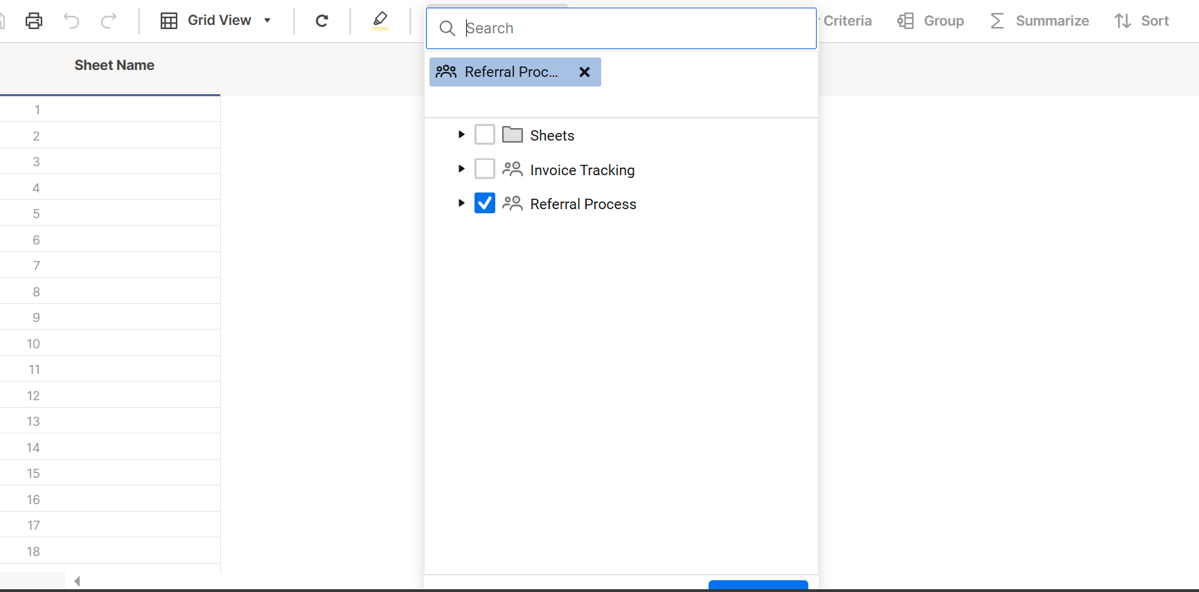
Hi,
I hope you're well and safe!
Yes, you could do that using cross-sheet formulas.
❓How many submissions and fields could there be?
I hope that helps!
Be safe, and have a fantastic day!
Best,
Andrée Starå | Workflow Consultant / CEO @ WORK BOLD
✅ Did my comment(s) help/answer your question or solve your problem? Please support the Community and me by marking it - Insightful 💡- Vote Up ⬆️ - Awesome ❤️ - or/and as the accepted answer. It will make it easier for others to find a solution or help to answer! I appreciate it, thanks!
 Andrée Starå
Re: May Question of the Month - Join the conversation and receive a badge
I would describe my job to a 5-year old as:
I put pictures, words, numbers, and graphs on slides. Leaders at my company want to see big line go up, or big line go down, depending on the situation. It's my job to help them understand why the line is going up or down, so we can make adjustments as a company.
 Will Duplex
Re: Pivot App is not recognizing the Contact Columns
I'm experiencing the same issue. We have monthly pivot sheets that we built more than four years ago. They were working well until recently. We used to have no issue showing the contacts as columns, but, like you, suddenly all the contacts are showing as <BLANK>. We need these to be multi-contact columns because they are used in automations. The pivots run every hour, so it's not feasible to change the contact column each time the pivot runs.
 jmhoward
Report UI - Unable to Select "Submit" in Full Screen View
Hi, new user here. Am incredibly frustrated with the UI/UX of this application. I have my browser in full screen, Smartsheet app is full screen. I am trying to sync a sheet to a new report. As you can see in my screenshot, the "submit" button on the popup is almost completely invisible. I actually don't even know if it says "submit" because I cannot fully see the button. The page will not allow me to scroll down to fully view the pop up. There is no way for me to see the bottom of this pop up, much less the pop up in its entirety.
I have encountered a similar situation on sheets and reports. I will have the browser in full screen, Smartsheet app in full screen, yet I still have to scroll down (usually end up accidentally scrolling down on the sheet too) the page to get to the horizontal scroll bar at the bottom of the page.
I spend far too much time fighting with the UI/UX of this application. It really needs to be redesigned to be more intuitive and user friendly.
 Jennnnnnnnn
Re: Column Links Now Generally Available!
This is awesome, but when will we be able to use all these Table features in our Main Grid View?
Table view is cool and all, but we all know that Grid view is the standard and most used here, so releasing features for a view that most of us prefer NOT to use, isnt going to help Smartsheets business plan or this years Agenda, but releasing those features in Grid view, now thats something most of us can get excited about. 🤸
 Julie Becker
Series fill line stop overlay or dilute of colors
For series where I choose Fill Line, it overlays the others above it. We have a huge dashboard with many line graphs with green/yellow/red benchmark lines, and red ends up as orange. Our Chief Medical Officer wanted it changed to red, but there is no way to get it to stop diluting the red and ending up with orange. Please make it so we can go for x% to x% in a color or something like that - or don't dilute the colors!
Deb Peters
Ability to do line graph with year over year (or other period)
Currently I have to do separate rows for every quarter if I want to do a line graph showing quarter over quarter or year over year. However, then it is hard to do a chart display with the same data. We are having to make 2 sheets and link every single field to the other sheet to be able to do both types of graphing. Please make it easier to make period over period line graphs!!
Deb Peters
View only license in Resource Management
Setup view only license access for the resource management schedule screen
nick.wilson
Re: Chart Labels: drag labels overlap & stacked column labels
Dashboard charts offers a setting to be able to rotate the text for the data labels. From the image, you can see that the data labels on the x-axis are hard to read for date and time when there are several data points. Being able to rotate the text will help for better readability.
 Derek311