Need to remove decimals from my Dashboard pie Charts. Please help.

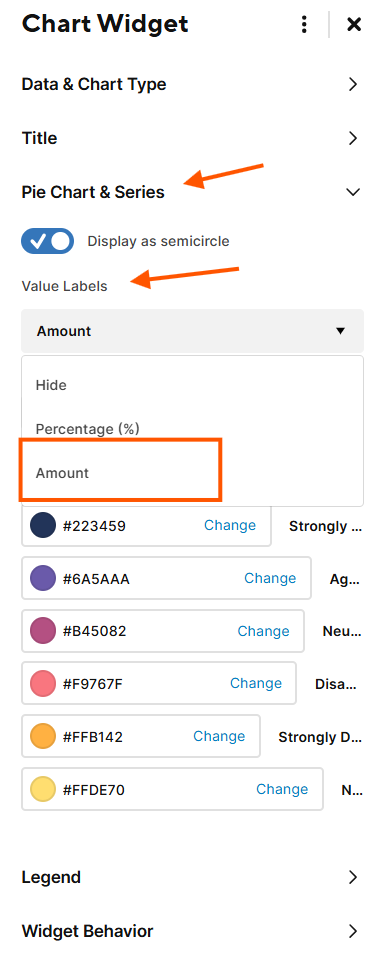
I have tried reformatting my metric sheet multiple times, but i can't get rid of the decimals in my pie charts. :( The original percentage is coming from a formula, if that makes a difference.
here is the data in my sheet
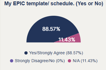
below is how it shows in my dashboard.
I have also tried editing my formula to round my results
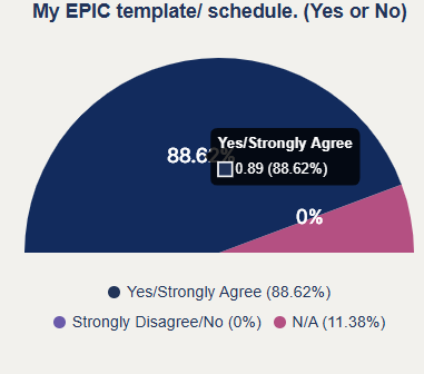
and I end up with this. I hovered over to show that it pulls my correct number but still insists on giving me the decimals (and now they are weirdly incorrect.)
I have searched and I haven't found anyone. with my particular problem, who's answer actually fixed my problem. :(
Best Answer
-
I figured it out… select "amount" instead of Percentage. I assume this is because my data was already in percentage format? but it worked like a charm. Now if only you can adjust multiple charts at once… :( Had to update 20+ charts individually.
Answers
-
Did you switch to the "updated chart styles" I did that and all my charts changed to include decimals, so I switched back.
-
Hi @Kelly Kenney - Thank you for the quick reply.
Yes I am in the new version. I would change it back, but they will phase out the old version eventually anyway, so I will still be stuck with my decimal problem either now, or later. I prefer to find an actual fix for this. (Honestly, the new version really stinks.)😒
-
I also tried just using the straight numbers and letting the charts do the percentages. that also did not work.
-
Agree, I was worried they are going to make it permanent, it changes my charts so drastically, not happy about that 😡
-
I figured it out… select "amount" instead of Percentage. I assume this is because my data was already in percentage format? but it worked like a charm. Now if only you can adjust multiple charts at once… :( Had to update 20+ charts individually.
-
I agree, this is really annoying and distracting. I'd like to show percentages in my chart widgets so going switching to amount doesn't meet my need, but the percentages with decimals is hugely distracting. I am unable to switch back to the old charts. This is going to make my internal customers crabby. Please fix this Smartsheet! Give an option to show them or not. They DO NOT show in my underlying sheet.
Andrea Zenner
Program Manager | Infrastructure & Operations
Apogee Enterprises
EAP | Mobilizer | Core Product Certified | Superstar
azenner@apog.com
-
I am dealing with the same thing. I don't want any values tied to my legend, only the color and name of that slice of pie, like it does for bar graphs. This ruins my dashboards because it adds so much extra space to the legend, the pie becomes too small to see.
-
Smartsheets - needs to revert back - the decimals need to be removed. This has also ruined all my dashboards and views. And my executive leadership also does not like the decimals nor the new views. not sure why this was even implemented without talking with end users. This is very bad - please change back asap. I can't even go back to the old views now. We also do not like the new dashboard version. It is not good.
-
@Amackay , did you try my fix in the screenshot above? this fixed my decimal problem.
-
@Deonizia Egan Changing to Amount would never have a decimal because it's just a count. In my case, and I'm assuming in other cases, we want the percentage values to show, not the count. I want to know 25%, not 167 in my charts. So switching to amount doesn't solve the problem for me.
Andrea Zenner
Program Manager | Infrastructure & Operations
Apogee Enterprises
EAP | Mobilizer | Core Product Certified | Superstar
azenner@apog.com
-
Since this is still in EAP, we can provide our feedback using the form linked in the original post o fthis thread:
-
@Andrea Zenner if you make your data in your metrics a percent, then use "amount" in the dashbaord it will remove the decimals from your dashboard. that is what worked for me.
-
@Deonizia Egan Thank you for the workaround, however I think that is an impractical solution for the number of dashboards we have using chart widgets with percentages. I may use this on some that are visible to leadership, but I'm not going to do this for every chart we have. Smartsheet needs to allow rounding again. I provided feedback via EAP.
Andrea Zenner
Program Manager | Infrastructure & Operations
Apogee Enterprises
EAP | Mobilizer | Core Product Certified | Superstar
azenner@apog.com
-
@Andrea Zenner totally get it. :) Might help others, too. though. Good Luck! If you haven't already, go to the page provided by Paul above and use the "feedback" tab. You can also comment, but the feedback form is what they monitor the most.