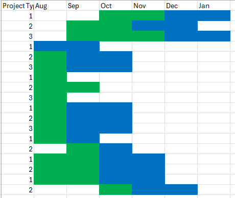
Hello, I am currently using the Project Management Office Template. I have many many projects in here. I am having trouble visualizing the Gannt charts when trying to pull in a lot of projects and compare. I'd like to get something very simple like this:
I need to be able to see:
- How many projects I need to close per month in order to keep current timelines
- How many of a certain project type overlap for resourcing
- A view of the whole year that can be seen on one screen
Visualizing the same data directly in smartsheet is very cumbersome. The data up here is color coded by phase transition which may look different in smartsheet but this is the general info I need. Is there a trick to getting this to work in Gantt or is there another visualizing tool I can use?

