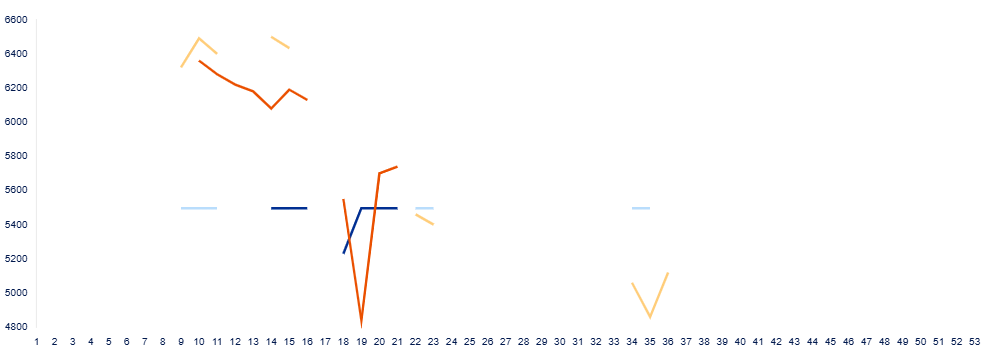
I have a sparse data set that I am trying to plot on a dashboard, and we were using a line graph, but because the data is so scattered it doesn't present well:
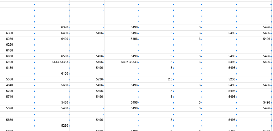
If I hover over the graph you can see the missing data points:
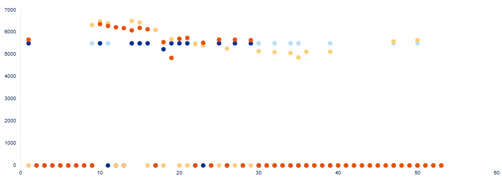
So I thought I would try a scatter plot, but when I do all the "zeros" show up:
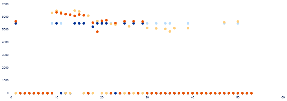
These data are graphing from an IFERROR(AVG(COLLECT())) formula and the "if error" returns "no data" - I am wondering how to keep those values from plotting as zeros.