Hi!
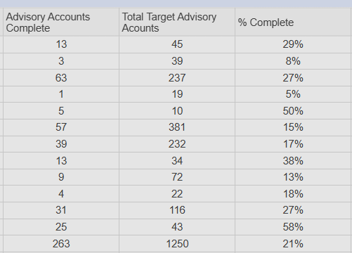
I have a Dashboard feeding off pretty simple raw data. It's mainly detailing this is how many accounts we think we'll get, this is how many we've gotten and then provides a %. I wanted to add a chart just to pretty it up a bit but now the % done is reporting differently and I have no clue why. Here is the raw data:
The % complete column is obtained by the simple formula

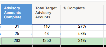
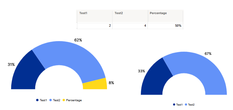
Now the chart….why why why is it showing only 17 % completed? It even shows the correct # of completed accounts vs target accounts. The screenshot below shows 263 completed, like the raw data. When I hover over the Total Target (lighter blue) it shows as 1250 like the raw data
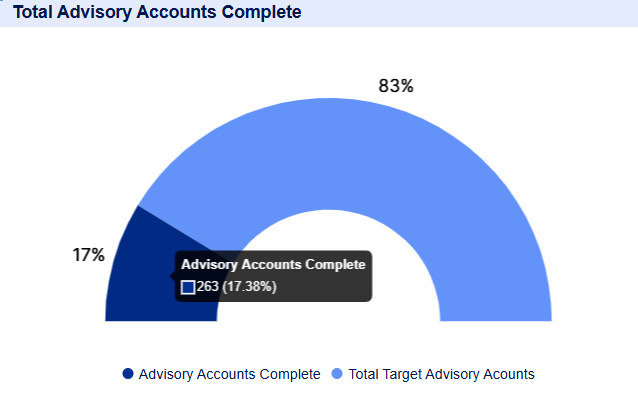
This is the data set that I have it pulling from - it's hard to see but the Advisory Accounts Complete column total of 263 and the Total Target Advisory Accounts of 1250 are highlighted in grey showing the chart is pulling that information.