Hi,
I have 2000+ row of data.
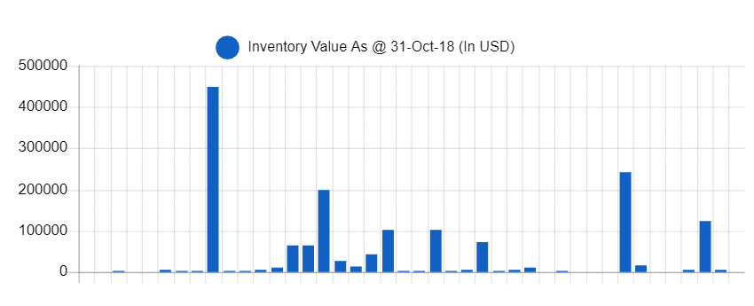
When i create a chart, instead of summing up my $ amount with the same categories (for example item A and item ") , it create the bar according to number of items.( for example: item A has 3 items, it appear 3 bar).
, it create the bar according to number of items.( for example: item A has 3 items, it appear 3 bar).
Anyone can help on this?
Thanks