ScatterPlot Axis Labels in Dashboard

I've seen some posts about scatterplots, but didn't find comments on the following aspects of scatterplots specifically

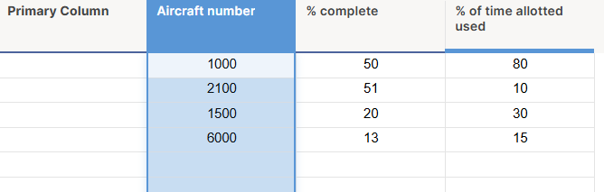
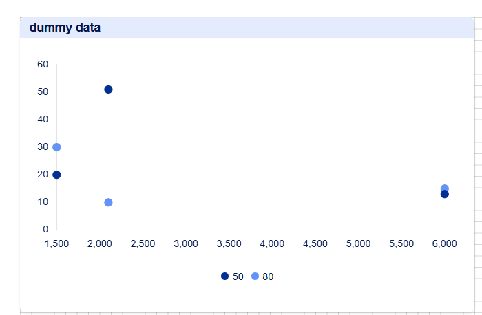
I have numerical data in one column (total score) and a single select in another columns (Level of Effort) that I would like to show on a scatter plot. I've managed to create the scatter plot below, but am stuck on the following items:

1) how do i make labels show up for my dots, tied to another column in my source data? Both as (1) hover over pop ups and (2) on the chart next to the dot. At present i'm just seeing the x and y values when i hover over the dot.

2) My x-axis is showing the same single select value over and over. How do i get it to roll up into one x-axis label per single select value (e.g. 1 - Low, 2 - Medium, 3 - High shown one time each)?

3)How can i have my x-axis labeled 1-Low, 2-Medium, 3-High (left to right), not 3-High, 2-Medium, 1-Low?

Additionally, i don't believe the following things are possible in SmartSheet, please correct me if i'm wrong:

a) having different size dots based on total score, for example.

b) having different color dots, based on a single select value from the data source.


Answers

  • Hi @KimL

    There currently isn't a way to add more data to what appears when you hover over a value in a scatter chart.

    I would actually suggest rearranging how your data is configured in your source sheet for this! It sounds like you may want to have 3 columns, one for each of your single-select values:

    The Column order dictates the order of the values, so you'll want "1 - Low" to be the left-most column in your source sheet.

    That way the chart will be able to overlap values based on the row, so you can display multiple points in one line, like this:

    Notice that this then Groups the values and colours them individually based on the column.

    On the Series tab you can then select "Always show value label" like above to show the data point. This is also where you can change colours per selection.


    However, based on your explanation, it sounds like you want the X-Axis to have 3 points (the three dropdown lists) and then above that to see all of the points in a row. In this instance I would recommend using a Stacked Bar Chart instead of a Scatter Chart.

    You'll want 3 rows in your source sheet (in the order that you want the X-Axis to appear):

    Then you can use this in a Stacked Bar, like so:

    Notice that the Column Names turn into the legend, which means I can then choose unique colours for each value.


    If this hasn't helped, it would be useful to know more about the type of chart you're looking to surface, and why, along with seeing a picture of your source sheet (but please block out sensitive data). There may be another way to get to your end goal!

    Cheers,

    Genevieve

    Join us at Smartsheet ENGAGE 2024 🎉
    October 8 - 10, Seattle, WA | Register now