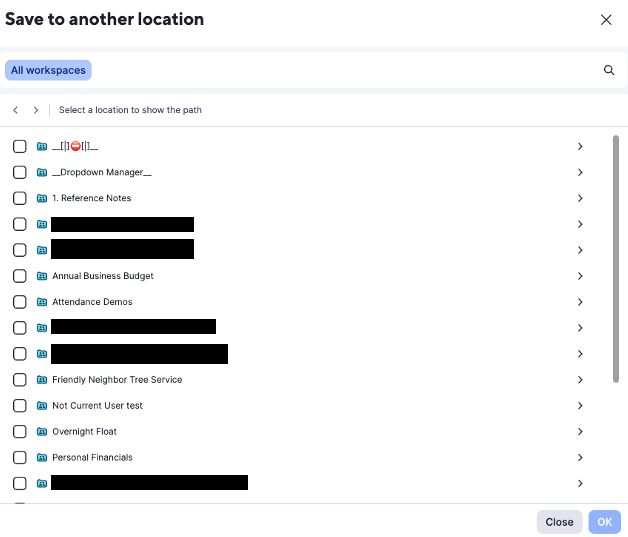
I don't have any screenshots of the old UI for browsing when saving something as new, but I do remember it was much more user friendly. Having the arrows to expand / collapse a workspace / folder on the far right is very counter intuitive. Even the very small bit of "instruction" is misleading. Clicking on a workspace or folder simply selects that workspace / folder as the location instead fo expanding it to be able to see the sub-folders.