I found another idea from about 2 years ago that hadn't been updated, so I figured I would ask if this is already on the radar/roadmap.
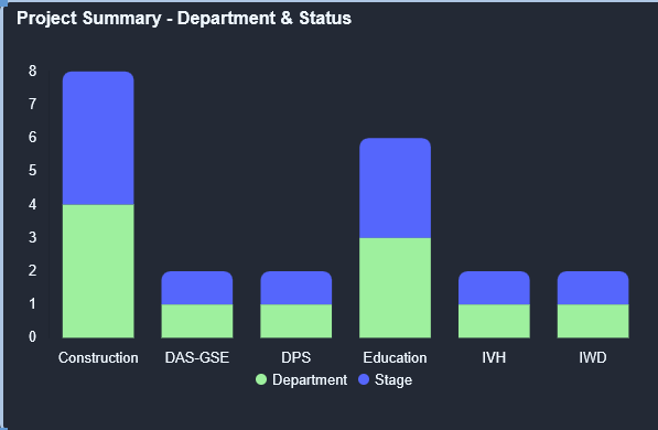
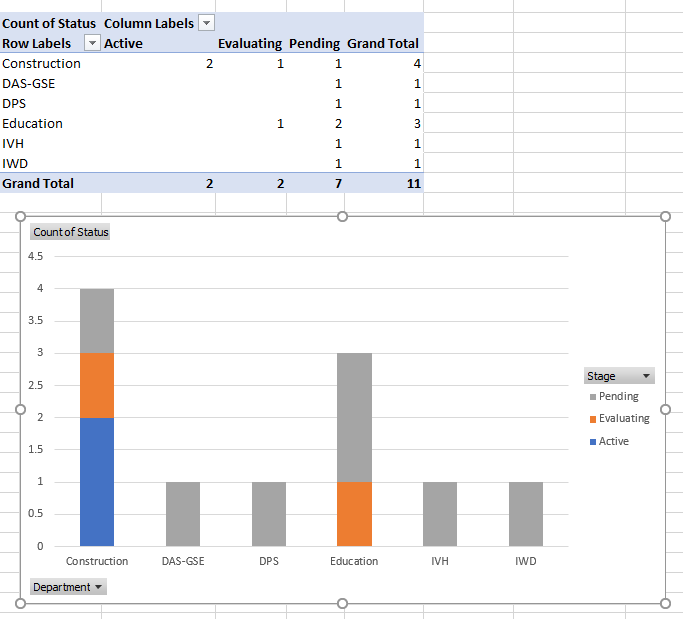
I would like to have the ability to use a stacked bar chart on my dashboard to show projects by Department and by Status. Here's an example I mocked up in Excel to show kind of what I'm looking for:
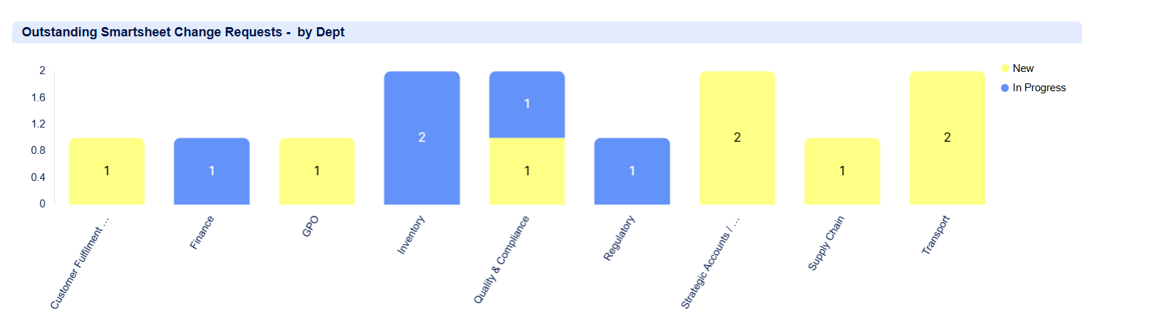
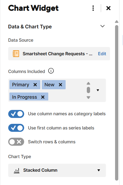
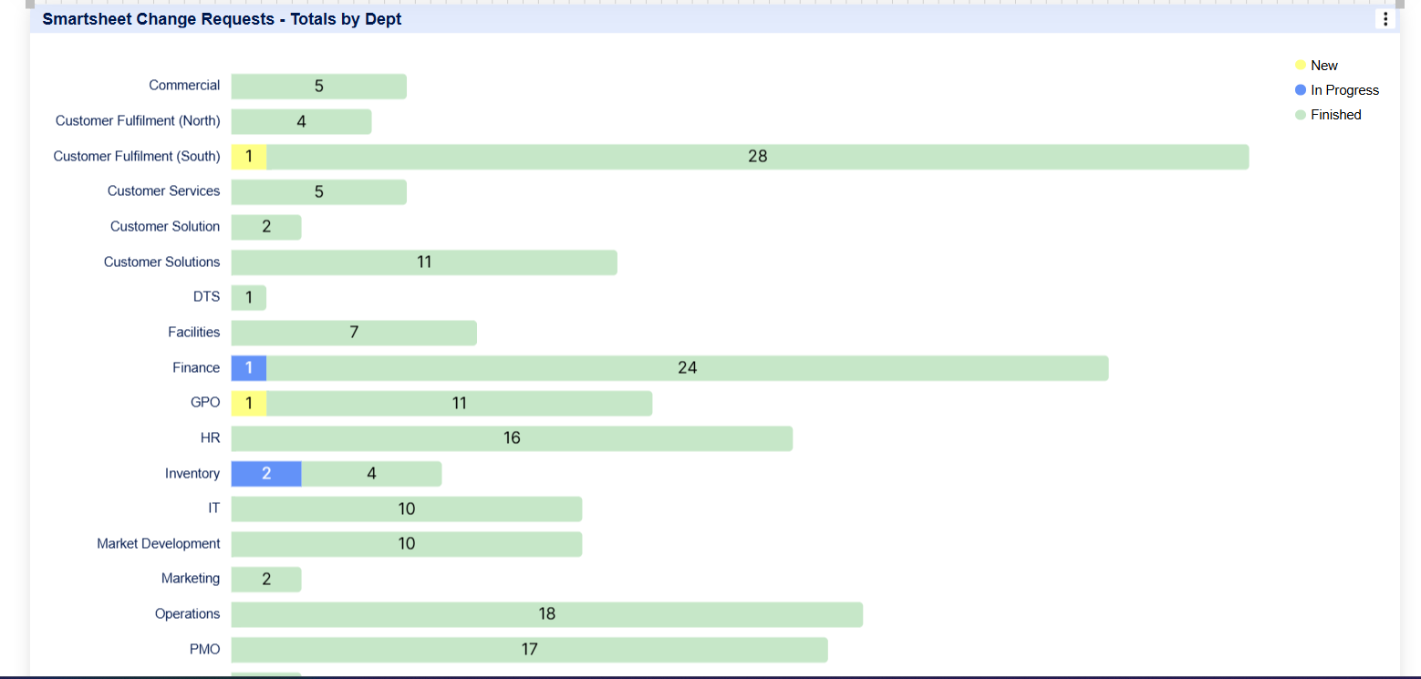
When I tried to show the same data in a Smartsheet dashboard, it just stacks "Stage" on top of the Department count, but it's just a total of how many have a Stage set, not a count of how may are in each stage. This chart is the same data as in Excel, but Smartsheet just doubles the projects - it counts 4 in Construction plus 4 that have a stage.