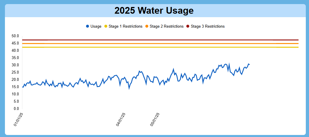
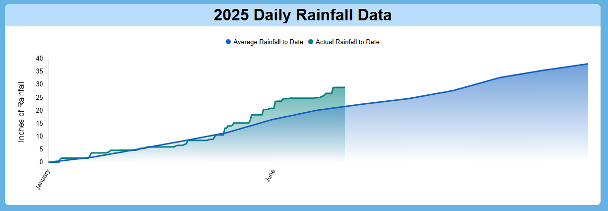
After the most recent Smartsheet dashboard update, there is an issue with how dates are displayed on the x-axis of existing charts. Previously, my charts showed the full range of relevant dates, which was essential for accurately communicating trends and timelines. However, post-update, the x-axis now only displays two-three random dates that are not even the first or last in the sequence this makes the charts nearly unusable for tracking progression or presenting data clearly. I've included screenshots from each chart for reference and please note that all charts are displayed at their maximum size.
I’m requesting that Smartsheet either:
- Revert to the previous behavior where full date labels were shown.
- Or give users the option to customize how many and which dates appear on the x-axis of charts.
I believe this change has broad impact, and restoring or improving this functionality would benefit numerous dashboards across teams and industries. If this affects you too, please upvote so the issue gets visibility. Thanks!