Charts on dashboard not displaying % evenly

c1avzz
c1avzz
edited 12/09/19 in Smartsheet Basics

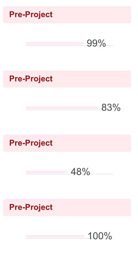
I have created 4 projects and pulled them together on a dashboard. I have created a chart for each section but I have noticed that the lines dont line up. For example on the attached image you will see that the 83% line is further along than the 100%. I have got exactly the same settings on each chart and not using the automatic adjust horizontal but this doesnt seem to look right.

I think this may be related to the fact that when you hover over the bar it say 83%/100% so I think I may have something not setup correctly on the number type. 


I am getting the data from a % field in a sheet, that is then populated into a report. Each chart has its own report.


Any ideas???

Screenshot 2018-12-12 at 14.16.27.png

Comments

  • When I create a new chart from the 83% data I am not able to use a pie chart as this says its 100% but actually it is 83! See additional image if this make sense.

    Screenshot 2018-12-12 at 14.23.32.png

  • Paul Newcome
    Paul Newcome ✭✭✭✭✭✭

    For the bars... Are all of the widgets the same exact size?


    For the pie chart... If "83%" is the only data you are pulling, then it is 100% of the chart. Try pulling the actual numbers together as opposed to the percentages.

  • Hi Paul,


    The bars are exactly the same size - I know this will be a display thing but just looks wrong annoyingly.

    The 83% is coming from a status report in a Gantt sheet (via a report) but I am not comparing it to anything else. I only displayed the Pie to see if this was an issue. If I could get the bars to look right that is the ideal solution!

    Paul

  • Paul Newcome
    Paul Newcome ✭✭✭✭✭✭

    Hmm... I'm not sure on this one. If you are able to figure out what's going on, please post it. You've got me curious now.